How to Fix a Pixelated Image That Looks Blurry or Muddy
Fix blurry edges, muddy colors, and noisy dithering after the first conversion.
If your pixelated image looks blurry, muddy, or noisy, these cleanup steps help sharpen shapes, simplify color, and create a more intentional pixel art look.
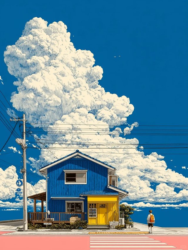
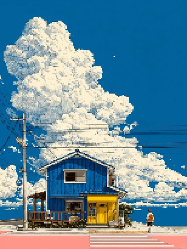
A pixelated image can still look soft, muddy, or noisy even after the first conversion. Most of the time the fix is not adding more effects, but tightening the palette, protecting the silhouette, and removing anything that makes the result feel less intentional.
If you want to test these changes live, open the Image to Pixel Art Converter. If your source comes from vector artwork, the Illustrator guide at How to Export Illustrator Artwork for Pixel Art is a good companion read.
Start with a clean base conversion
- Begin with a readable size before you touch the color sliders.
- If the subject is already hard to recognize, fix the size or crop first.
- Do not try to rescue a weak composition with heavy effects.
Limit the palette before polishing
- Lower the color count until the shapes feel more intentional.
- If skin, sky, or foliage break apart too much, add a few colors back instead of overusing saturation.
- Palette discipline usually creates a more retro look than extra sharpening.
Use contrast and saturation with restraint
- Small contrast adjustments often help outlines more than large jumps.
- Lower saturation if the result feels plastic or too modern.
- If the image looks flat, compare the source and only raise one slider at a time.
Add dithering only where it helps
- Dithering is useful when a smooth gradient needs texture.
- It is less useful when the real problem is too much detail in the source image.
- If the picture starts to sparkle or crawl, dial the effect back.
Compare the result at the size you will actually use
- A conversion can look great zoomed in and messy at export size.
- Check the result where it will live: icon, sprite, social graphic, or mockup.
- Make your last adjustment after that real-size check, not before.
Common mistakes
- Using too many colors because the source photo looks complex.
- Raising contrast and saturation together until the image feels harsh.
- Treating dithering as a fix for weak composition or bad cropping.
FAQ
Why does my result still look blurry?
Most of the time the image is too large, too soft, or carrying too many colors. Reduce the size first, then tighten the palette.
Should I increase the pixel size or lower the palette first?
Set the rough pixel size first. Once the shape reads well, use the palette to create a stronger retro look.
What is the fastest way to make a conversion feel more intentional?
Limit the palette, make one small contrast adjustment, and remove any effect that adds noise without improving the silhouette.
Keep editing inside the converter
Try the Image to Pixel Art Converter when you want to test palette, size, brightness, contrast, and dithering changes on a real image.
Related Articles
How to Export Illustrator Artwork for Pixel Art
Export Illustrator artwork with cleaner edges before converting it to pixel art. Learn which PNG export choices help preserve sharp shapes and reduce blur.
How to Pixelate an Image Online: Beginner Step-by-Step Guide
Learn how to pixelate an image online with a beginner-friendly workflow for choosing pixel size, reducing colors, and exporting a cleaner final result.